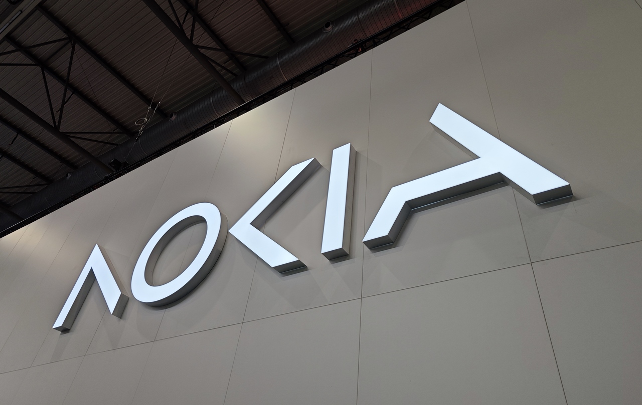
Nokia, the legendary phone and communications company, has changed its logo and plans to change its corporate identity for the first time in almost 60 years. Nokia presented its new logo at the Mobile World Congress in Barcelona.
The new logo consists of five different shapes, five stylized letters that together form the word NOKIA. In addition to the new “font” in the logo, Nokia has also ditched the iconic blue color of the old logo and will now use a wider range of colors for the new identity, depending on the usage.
“There was an association with smartphones and now we are a business technology company,” CEO Pekka Lundmark told Reuters in an interview ahead of the opening of Mobile World Congress in Barcelona.
Although Nokia is still looking to grow its service provider business, where it sells equipment to telecom companies, its main focus is now on selling equipment to other companies.
What does the new NOKIA logo look like?

“Last year we had a very good growth of 21% in enterprises, which now represents about 8% of our sales, (or) about 2 billion euros ($2.11 billion). We want to reach double digits as soon as possible,” said Lundmark.
Big tech firms are partnering with telecom equipment makers such as Nokia to sell private 5G networks and equipment for automated factories to customers, particularly in the manufacturing sector.
Source: Hot News
Ashley Bailey is a talented author and journalist known for her writing on trending topics. Currently working at 247 news reel, she brings readers fresh perspectives on current issues. With her well-researched and thought-provoking articles, she captures the zeitgeist and stays ahead of the latest trends. Ashley’s writing is a must-read for anyone interested in staying up-to-date with the latest developments.